Well, we have all been there haven’t we? You go to a friend’s house and need to use the loo after being caught short. Now you can really see the character of your friend… a quick nip to the guest cloakroom and a vision of hell is beholden before you.
It’s a tiny pokey little room, with a sink and a loo… no colour, no feeling. Occasionally, the mother-in-law’s wedding present picture is on the wall (because your friend didn’t want it showing in the house where they could see it every day), coats are hung on ugly hooks on the wall or behind the door. We could go on, but you get the picture.

So, come on Great Britain – let’s sort out our guest cloakrooms. Let’s turn those pokey spaces into wow spaces that your guests rave about when they come out.
Which Brassware Is Best?
Choose fittings that match. The taps, the sink drain and press plate for the toilet should not be shiny chrome; it’s a guest cloakroom, not an operating theatre. Opt for brushed metal products, be bold, pick a metal that picks up on the walls. If the walls are dark, think about brushed bronze, for example, or gunmetal. Lighter colours can also be used like nickel. Don’t be afraid to go bold if it fits the design, but the brassware must complement, not be the statement.
Although we often see funky retro copper pipework and garden type taps in restaurant toilets, we would not recommend it in your home – think of the weekly cleaning and polishing! Plus, don’t use flush handles, use push plates.
The Guest Cloakroom Suite
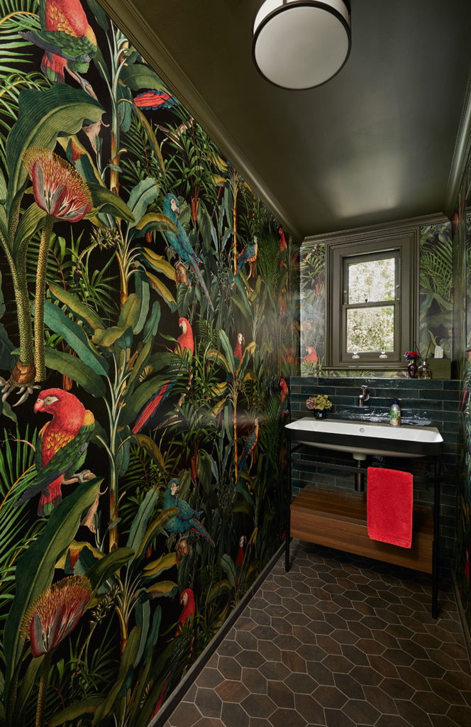
The sink should be small, not a huge place sufficient to do your washing in – just enough space to wash your hands. Think about the space of your guest cloakroom and how you get into it. If it is a long thin space (most are) with the entrance on a side wall, you could have a sink unit that goes across one end and a toilet at the other. Most don’t have this option though, so a small sink that does not take up too much room is preferred. Again, this does not have to be white gloss, but can match the wall design.
The toilet – ah, this is so critical. Think of your guest’s derriere when choosing your toilet and, again, the space. Too big a toilet and it will shrink the space, too small and it’s difficult to ‘perform’ and clean. Go to the showroom and try the toilets out, sit on them, find which one works for you and which don’t. Wall hung is a must; it’s easier to clean, makes the room seem bigger and gives a cleaner, neater look. Always wall hung, never floor mounted.
Wall hung toilets need a frame. We use Geberit – they are well made, strong, there is a large range of push plates that are compatible with them, and your builder will have had lots of experience fitting them so there will be no surprises. These can be boxed in and then tiled to match the wall covering.
Walls & Ceilings: Go Bold
We always go bold in a guest cloakroom with the wall design, from jungle scene patterns to ‘feature art deco’. Most guest cloakrooms are long and narrow, so you need to make them wider.

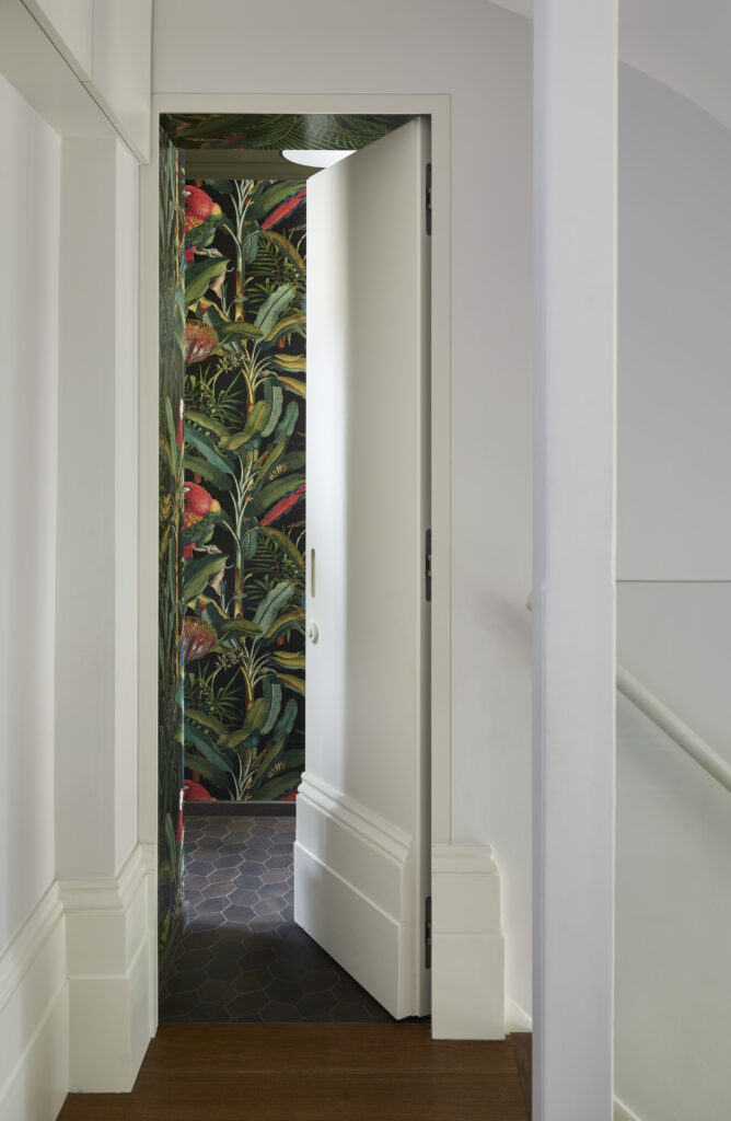
One way of doing this is 3D type wallpaper – such as our parrot wallpaper seen here. You can see it has depth and this gives the room a wider appearance than it actually has. If your ceiling allows it, think about putting in a raised dome with LED strip lighting around the edge, lighting it upwards in order to increase the size of the room. We also recently did a small cloakroom with scenes from the Milky Way. This again has depth and is an interesting viewing and talking point for your guests.
Guest Cloakroom Flooring
Flooring can be wood or tiling. Don’t go for carpet – it will get marked and will eventually smell from spills and splashes. Don’t forget the weight of the room should always be at the bottom. Think of the earth and sky… it is always dark at the ground, but the sky is lighter. Electric underfloor heating is a must-have to keep the room warm and cosy, but also dry and smell free.
Lighting (Little Is Best)
Lighting is critical to the design of a guest cloakroom. We recommend installing a PIR sensor to turn the lights on rather than your guests fumbling for a switch. Obviously make sure the timer is set for a decent amount of time. Small LEDs set into the wallpaper of a jungle scene like eyes of animals can add to the effect.
In a small room, the lighting should be small. Large downlights cancel the look, so smaller LED downlights of dim (ish) brightness will set the scene.
Hand Washing & Drying
Use soap dispensers rather than bars of soap – the latter get ugly and soggy. Again, the dispenser fittings must match or complement the sink fittings. White products don’t work in feature rooms unless, of course, the whole room is white, but you won’t do that because you don’t want to create an operating theatre.
Next, hand drying. You have made the guest cloakroom of your dreams, the walls are covered in scenes from a tropical jungle, colours are green, blues and pinks, and you put in a bright white hand towel. No! Everything has to be coordinated, so the hand towel has to complement the colours of the wallpaper you have chosen. If it’s a space scene, for example, pick out a colour from the nebula.

If there is space under the sink, have a basket of rolled-up hand drying towels like in top hotels, with a waste basket for used ones.
All that’s left for us to say: it’s the guest cloakroom, not a dumping ground. Meaning it’s not a place for your coat, shoes and the like. Find somewhere else for these, like a custom hallway cupboard.
Looking for more bathroom and cloakroom inspiration? Enjoy The Marble Bathroom or get in touch to discuss your next renovation project.