So, you have bitten the bullet and decided to go with a new kitchen – with an island! You’ve persuaded your other half to put their hand in their pocket and pay for it (even better, well done). Now come the important bits. One of the most crucial things to consider – which is often seriously overlooked – is kitchen lighting. More specifically, kitchen island lighting.
The lighting of yesteryear tended to be one switch with one central light or lots of small lights, invariably in the wrong place. With lighting, you have to remember its purpose – to be able to let you see what you are doing. However, it also has a secondary purpose and that is to create mood or wow factor. So let’s get started with our kitchen island lighting do’s and don’ts.

The Magic Of Plinth Lighting
Plinth lighting on the island is a great little feature, which adds warmth and tone to the flooring as well as Hygge to the room if open plan. Having just the plinth lighting on without all the other lights allows you to sit at the island, with friends, and have a gossip over a glass of good quality Malbec. The darkness in the background with the reflected light on the floor is perfect for this type of thing. Plinth lighting must always be warm white and a simple LED strip works well in this situation.
The Main Event: Overhead Lights
Now to the big feature: the overhead kitchen island lighting. Kitchen islands are often work surfaces, so you need good overhead lighting that lights your cutting/preparing space. This means that they need to be positioned so that they are not over you but in front of you, in order for them to shine down on your work area, and not on your body casting a shadow.
Simple LED ceiling lights, again in warm white (less than 3000 lumens), are perfect for this task. Sunken into the ceiling, connected into a dimmer, they allow an infinite amount of variation on how much light is shone onto the work surface. Place them approximately 1 to 1.5 metres apart to ensure good coverage.
The ‘Wow’ Moment
Your kitchen island lighting shouldn’t be basic – it needs something to make it stand out. After all, what’s the point of a new kitchen if you can’t make your friends green with envy? A hanging light over the island works wonders for this.
There are several different styles and takes on this; some can be a continual light, a bit like one which hangs over a snooker table, but in copper, while others can be individual hanging lights, and others a combination of the two.

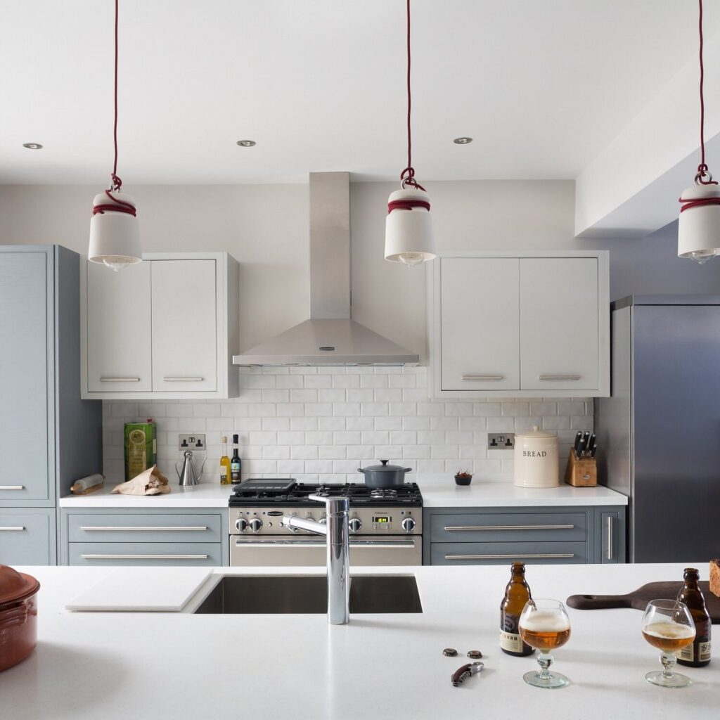
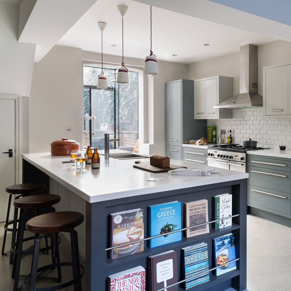
In this home you can see where we have placed three simple lights equidistant apart, but by using coloured (red in this case) cord, we have made a feature out of what otherwise would have been a boring light fitting. The red contrasts with the blue of the kitchen and the tying of the cord, like rope around a ship, adds to the feature.

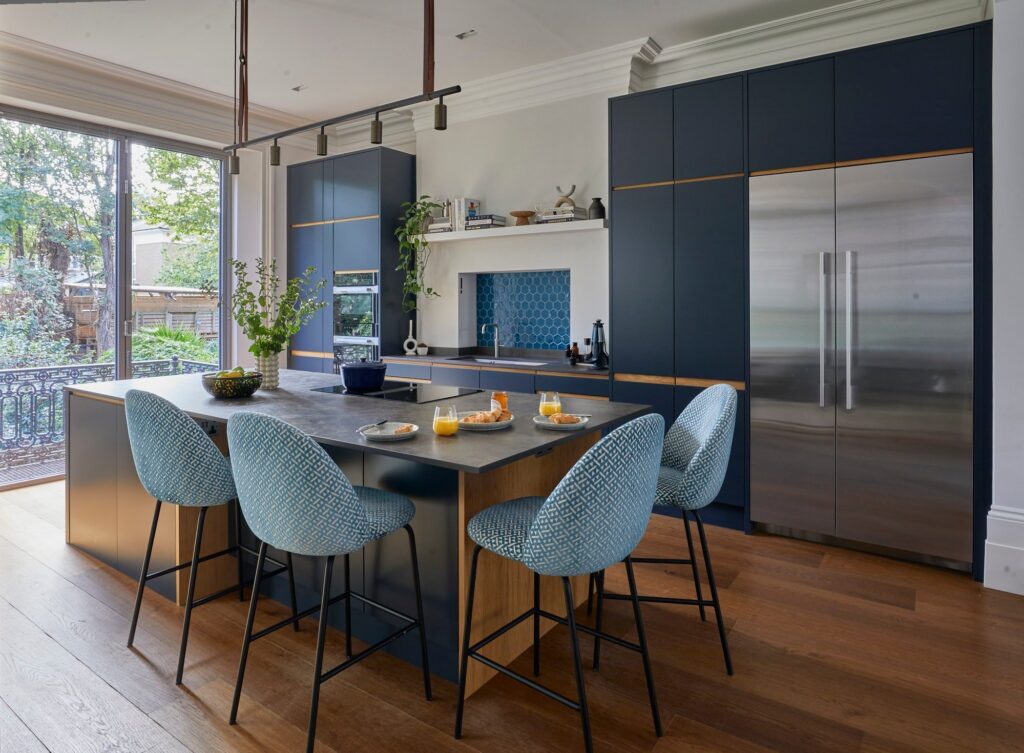
What we did for this kitchen island lighting is different and shows how the whole light fitting in itself is a feature, with leather straps, individual focussed lights, and gunmetal linking with the wood aspects of the kitchen.

Photography: Paul Craig
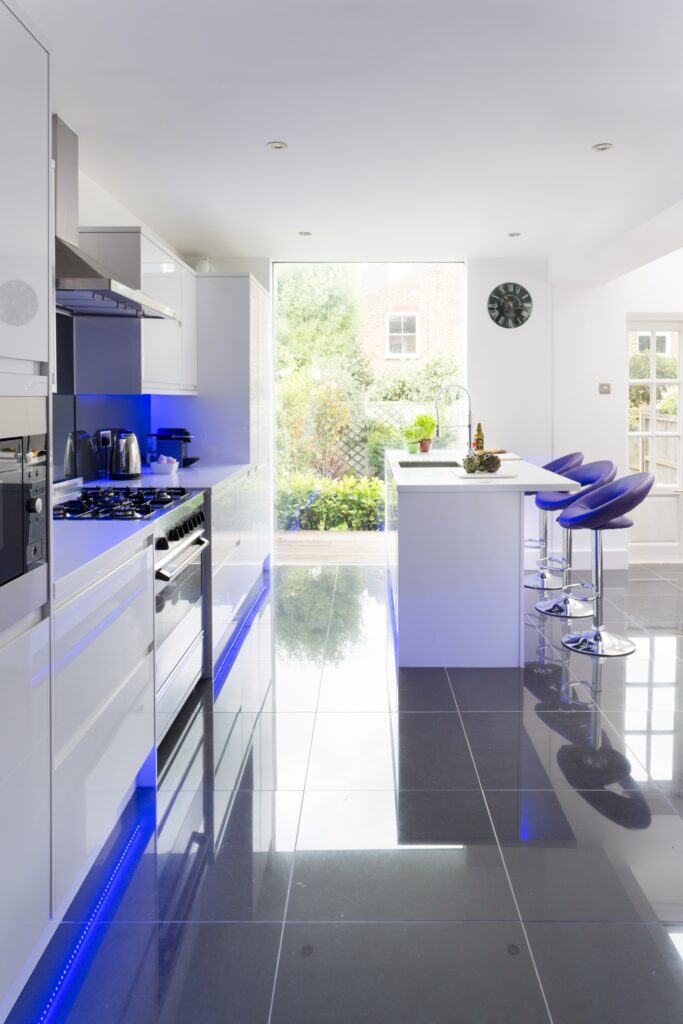
This client was a Spanish lady who loved polished marble floors, so we emphasised these with plinth lighting, allowing the light to add an extra dimension to the kitchen. This means the kitchen can be shut down, but not be a dark hole when they are sitting in their snug off to the right.
The kitchen island lighting, in this case, is under the breakfast bar area and not clearly visible in this image, however it washes down the right-hand side of the island, removing another ‘dark’ patch. The large picture window allows them to look out onto their garden from the moment they walk into their home from the front door.
The Kitchen Island Lighting Formula
The number of lights hanging over an island must always be an odd number. Interior design rule number one – evens do not work, ever.
People also often ask how low kitchen island lighting should be. The simple answer is low enough to work and look good, but not so low you (or the little ones) keep banging into it. If they are individual lights, you also don’t want to knock them as they might do a Newton’s Cradle, bang together and smash.
We’ve repeatedly mentioned warm white bulbs, but the reason for this is straightforward. We are all creatures of nature. As such, we expect subconsciously for the sky always to be blue (or in the UK, grey and rainy) and the bottom of our vision to be darker colours. We also expect, because the sun is orange in colour, for light to have an orange hue to it, not a blue-white one.
This is very important when choosing lighting. Think of what makes you cosy and comfortable and go with that. Blue light does not make anyone feel cosy and comfortable… more like they are about to sit in the dentist’s chair, and we all love that (not).
If you are thinking about a new kitchen or a new extension to house a new kitchen, get in touch with us. We can do all aspects, from the original architectural design of the extension and gaining planning, through to kitchen design, supply and build.